White Barn Home
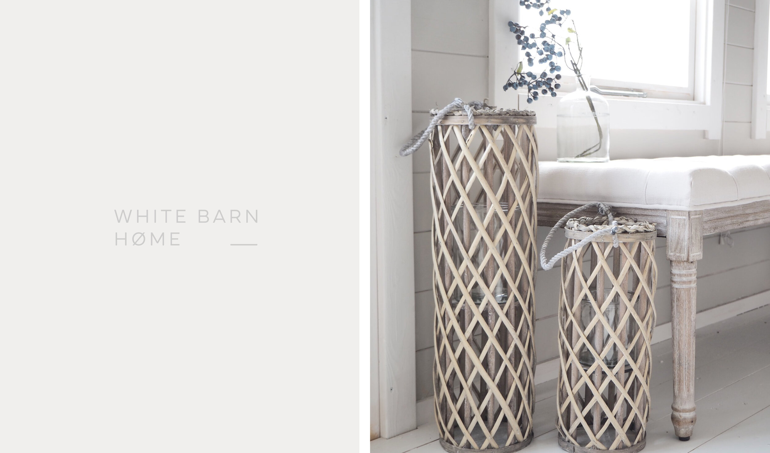
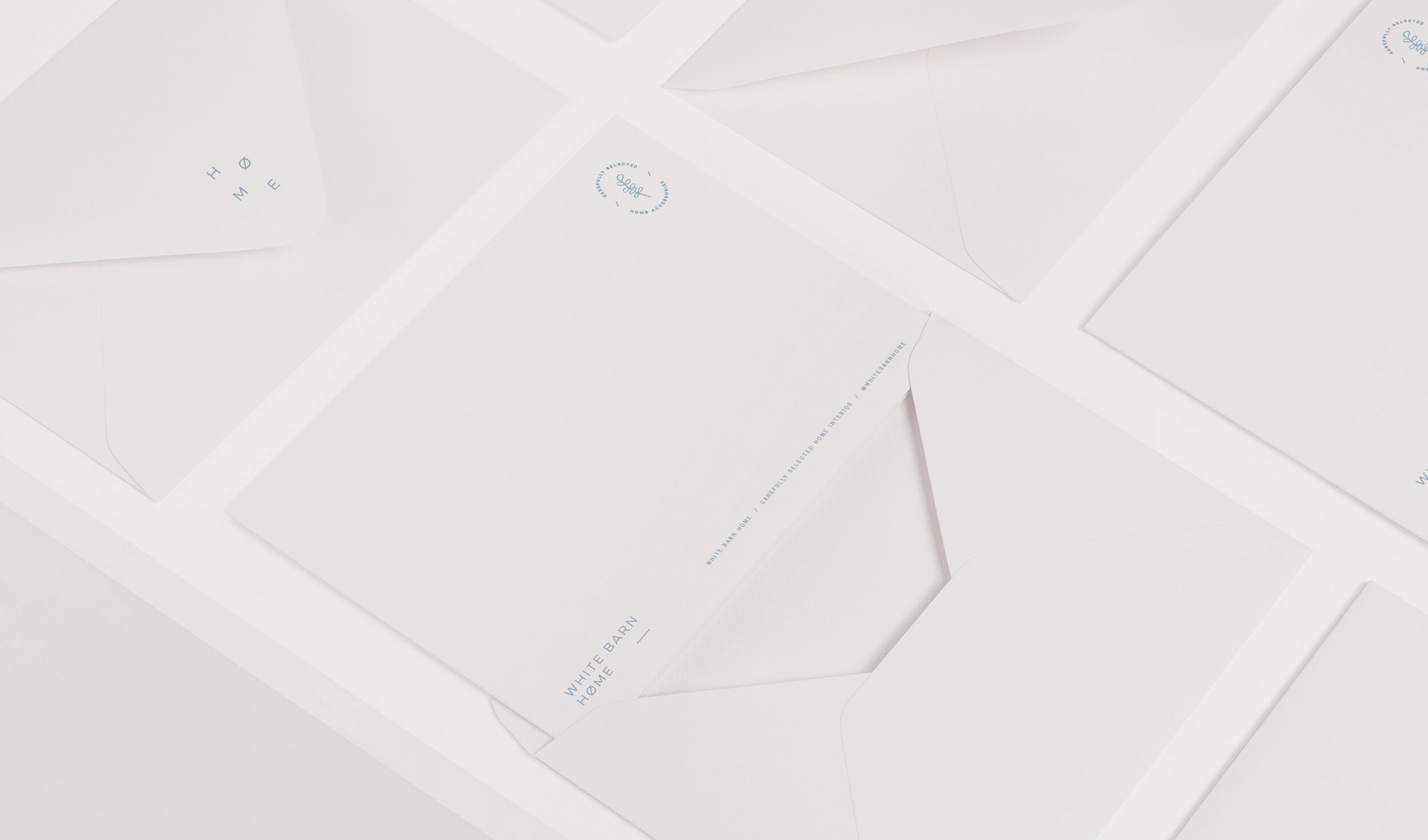
Alexandra (the lovely lady behind the business) was after a fresh lick of paint for her growing business. With Alex’s deep love for white interiors and natural materials I created a clean, minimalistic and flexible brand identity for her - Keeping in mind the rustic scandinavian / modern country vibe she envisioned.
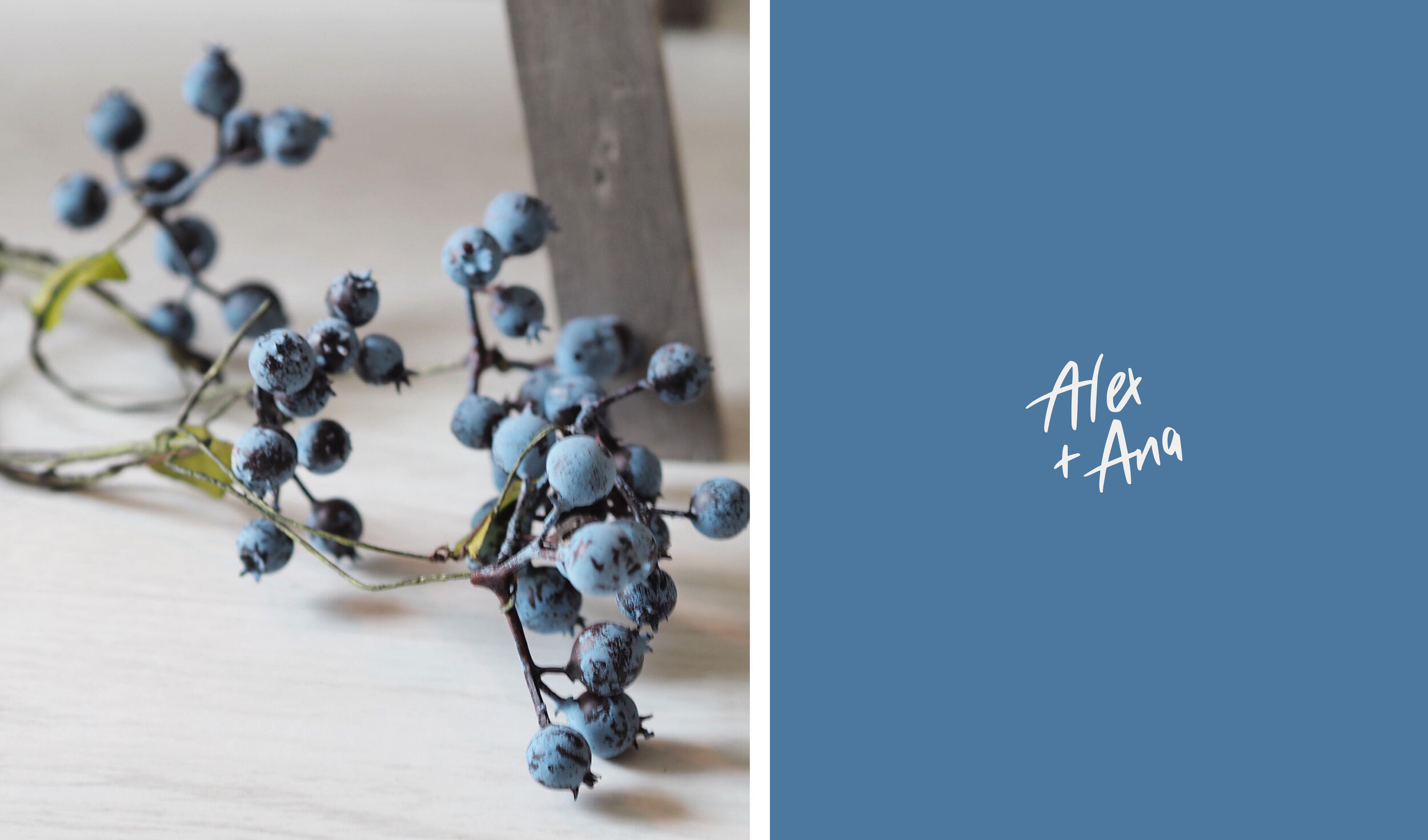
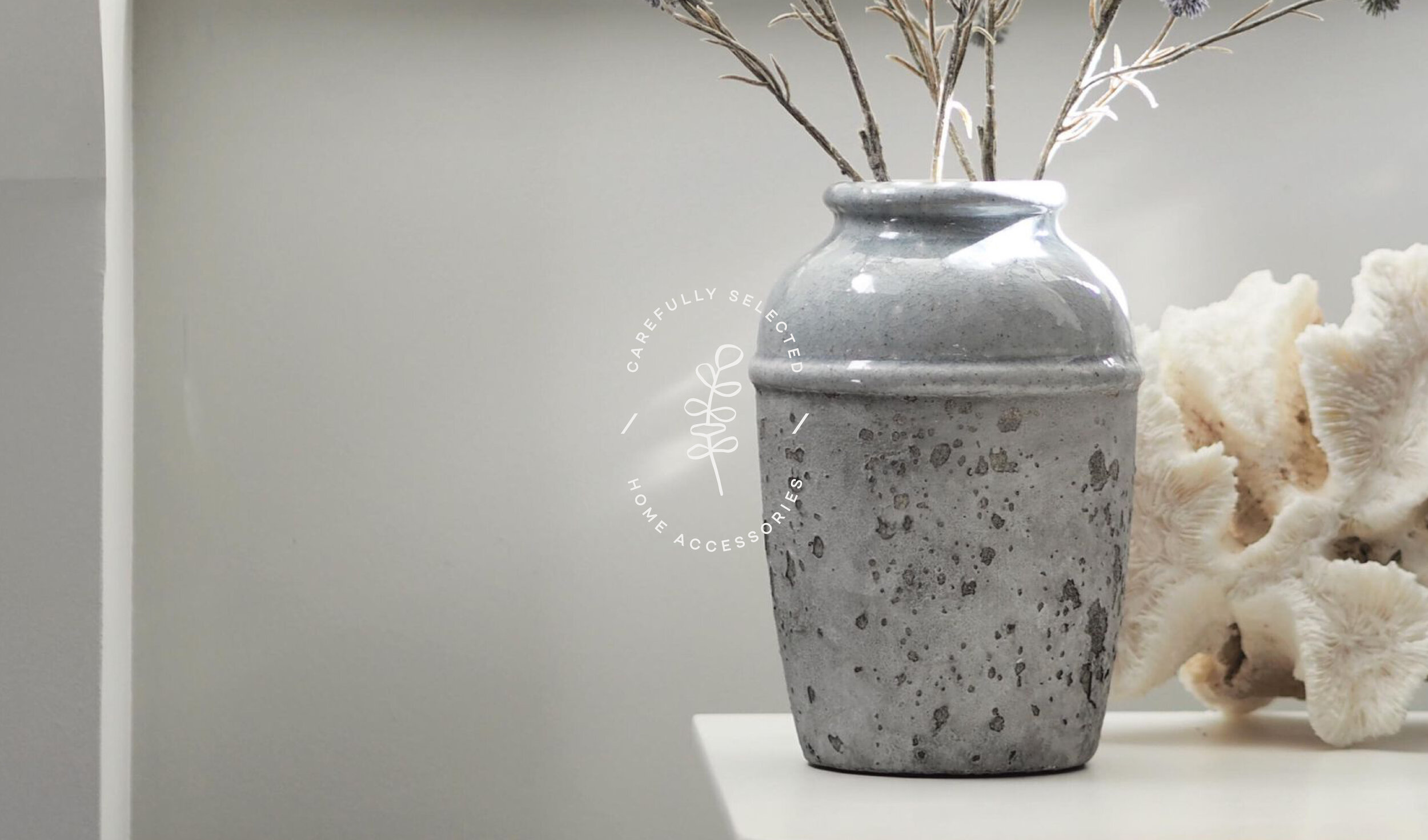
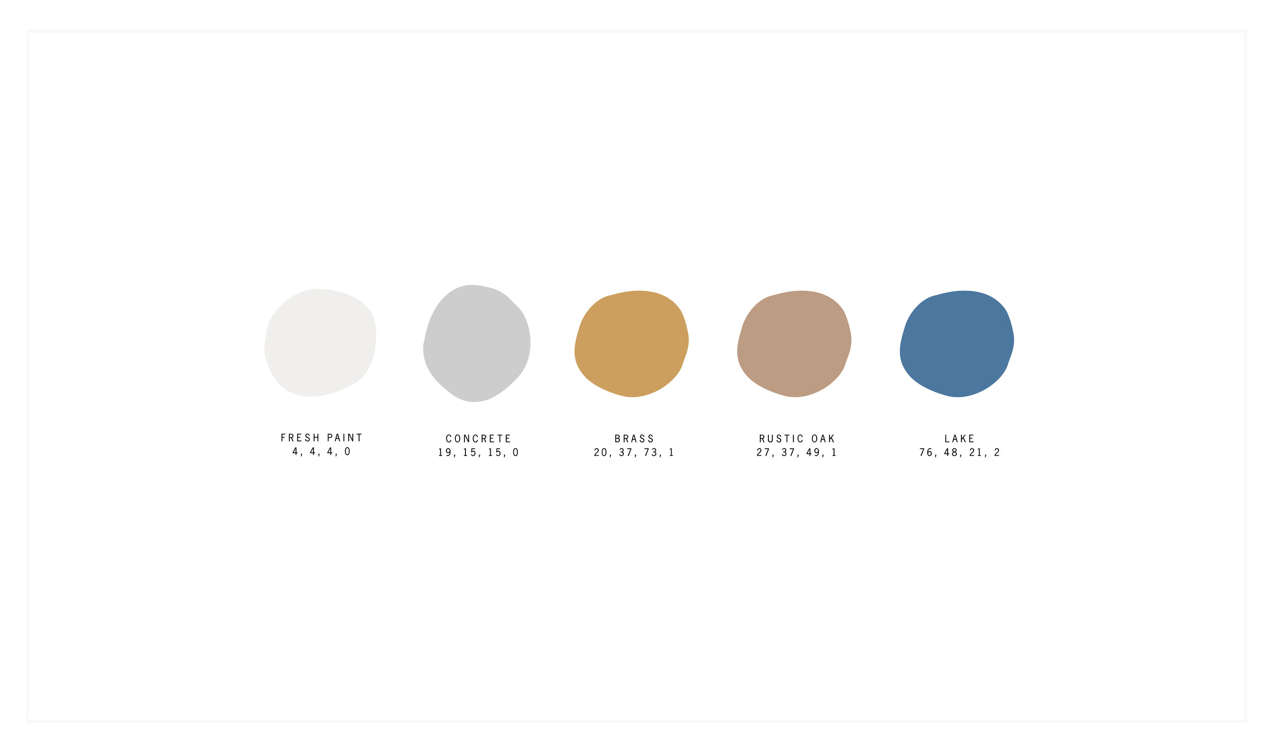
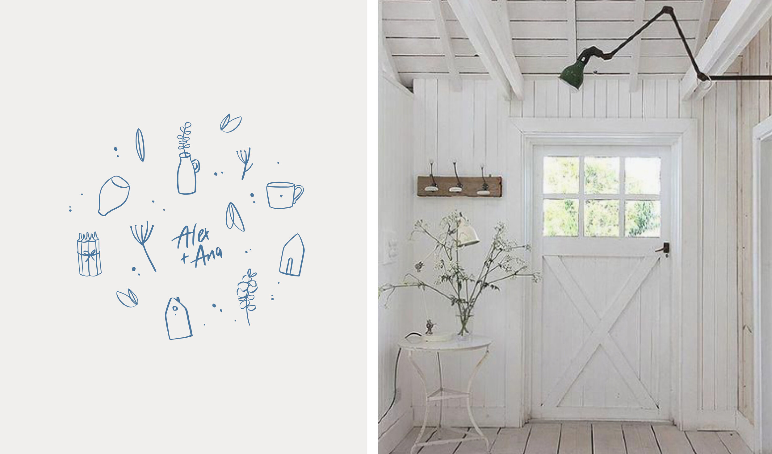
In addition to the primary logo and logo submarks I included a range of illustrations created from items that are available in her online shop all year round. The illustrations are intended to work individually or paired up to create patterns to be used for various items such as bespoke tissue paper and gift card designs. Within the colour concept Alex asked me to add subtle pops of colour to help stand out but not overwhelm.
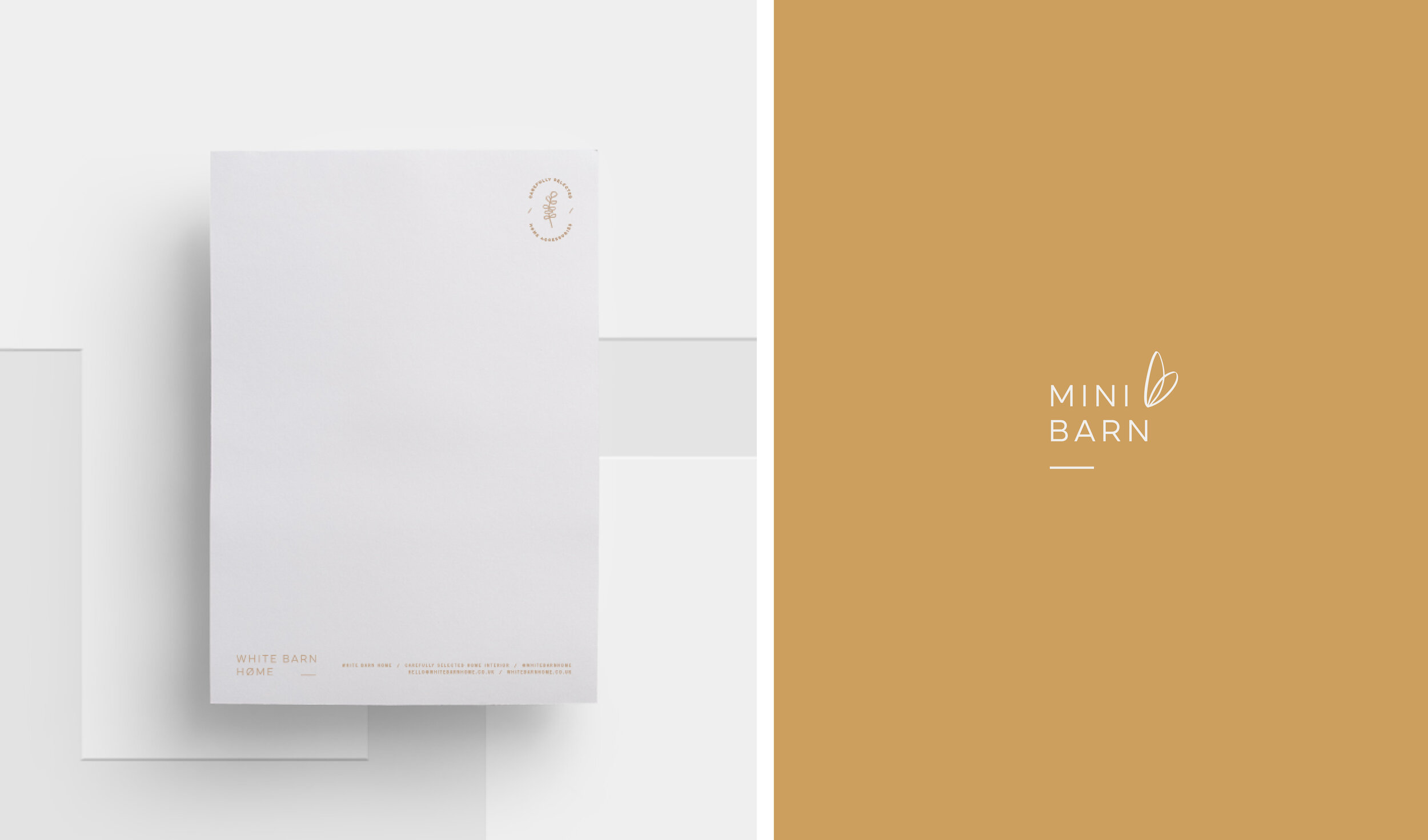
Alongside the White Barn Home brand identity, an adaption of the primary logo was created for a new venture. Mini Barn - A children’s section that will be added to the existing brand.
Alex herself chose to add the little leaf illustration for the Mini Barn logo adaption as this reminded her of the very first little leaves you might see on a tree when spring arrives, which is a lovely concept for the children's brand.
Services provided
Brand Identity, typography and colour concept.
Client
Alexandra Bethanis

